3 tips to mix colors in product packaging design
3 tips to mix colors in product packaging design
In this article, we will explore other color schemes, including complementary color combinations, complementary color schemes, alternating and complementary color combination of four in the design of product packaging, paper boxes and other publications.
Complementary color schemes are formed with three colors located at three different angles of the color circle and creating an equilateral triangle. With the complementary color scheme, because the three colors are located at three different angles on the palette, these colors combine and complement each other to create a balance for product packaging.
However, because of the balance in combining colors by the complementary color scheme, although there are three colors used, sometimes designers and consumers will find this color scheme quite simple and not creativity.
Among all the color schemes in packing design and paper boxes, the complementary three-color scheme is considered the safest color scheme among the color schemes.
The downside of this color scheme is the problem of creating accents in the packaging of paper and paper boxes. However, some designers love this color scheme because they often help packaging publications to be quickly received and have good feedback from customers because of the harmony and balance of the colors.
>>> Improve these to have accuracy colors for product packaging
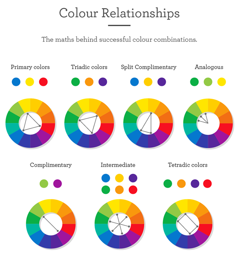
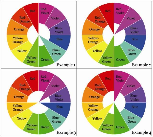
One of the most creative color schemes is the split-complementary. This scheme is made up of three colors located at three different angles on the palette and creating an isosceles triangle. Sometimes, paper and box packaging designers also use a fourth color, which is usually symmetrical with one of the two colors that make up the base of the isosceles triangle.
The split-complementary color scheme creates flexibility in color selection and color combination so it often gives designers a lot of opportunities to explore and find strange and unique color pairs for product packaging design.
Currently, there are many packaging designers prefer color schemes in this way. Typically, designers use black and white as the main color, adorned with eye-catching third colors like red and blue with extra details. Alternating complementary color schemes are relatively simple and safe but extremely effective.
However, to challenge themselves as well as want paper packaging designs, paper boxes become more eye-catching and unique, designers often use the main colors of yellow, red, blue to have the sublimation in design template.
To attract and impress the user at first sight, this alternating complementary color scheme will be the perfect choice for your paper box and packaging design.
>>> 5 basic principles in good product packaging design
The complementary set of four colors is the most complex of all the color schemes in product packaging design. However, if the designer takes the time and effort to choose the colors carefully, this color scheme will be a reward when it will give your product packaging design a modern look. and new, very suitable for many design trends today.
The rectangular tetradic scheme is formed with two complementary colors directly. The complementary as well as complementarities between these two pairs of colors are the key and distinctive characteristics of this color scheme.
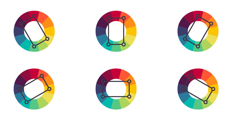
At first glance, color pairs in complementary four-color schemes are difficult to coordinate and use them properly, so the designer will spend a lot of time selecting and coloring the packaging design and paper box. However, the fruits of this effort will surprise the designer and the customer with the effect it brings.
Designers should pay special attention to the balance between two hot colors (red, orange or yellow) and cold (blue, purple). This is the key to the difference and the outcome of the color combination with this method.
>>> The power of the CMYK color system in offset printing
.jpg)
What color to choose? How color scheme? Those are the questions that designers of paper and paper box packaging must answer by themselves. Highly aesthetic color design promotes the interest and use of consumer goods. How the color scheme to make your design touch the hearts of customers is the designer's mission. Therefore, the design stage always requires color coordination skills as well as accurate color sensitivity of the designer.
The principle set in the design of printed paper bags and beautiful packaging is to create ideas and choose colors that express the most creativity possible. Always remember: Color is the first message of the product aimed at consumers and consumers will feel it immediately.
Khang Thanh - The packaging manufacturer in Vietnam specializes in producing paper bags, carton box, carton offset, labels, hangtag, books, calendar, POSM and so on.
KHANG THANH - HOUSE OF PACKAGING
Tel: +84 (0) 77 8878 222
Email: info@khangthanh.com
Triadic complementary color scheme in product packaging
Complementary color schemes are formed with three colors located at three different angles of the color circle and creating an equilateral triangle. With the complementary color scheme, because the three colors are located at three different angles on the palette, these colors combine and complement each other to create a balance for product packaging.However, because of the balance in combining colors by the complementary color scheme, although there are three colors used, sometimes designers and consumers will find this color scheme quite simple and not creativity.
Among all the color schemes in packing design and paper boxes, the complementary three-color scheme is considered the safest color scheme among the color schemes.
The downside of this color scheme is the problem of creating accents in the packaging of paper and paper boxes. However, some designers love this color scheme because they often help packaging publications to be quickly received and have good feedback from customers because of the harmony and balance of the colors.
>>> Improve these to have accuracy colors for product packaging

Split-complementary color scheme in product packaging designs
One of the most creative color schemes is the split-complementary. This scheme is made up of three colors located at three different angles on the palette and creating an isosceles triangle. Sometimes, paper and box packaging designers also use a fourth color, which is usually symmetrical with one of the two colors that make up the base of the isosceles triangle.The split-complementary color scheme creates flexibility in color selection and color combination so it often gives designers a lot of opportunities to explore and find strange and unique color pairs for product packaging design.
Currently, there are many packaging designers prefer color schemes in this way. Typically, designers use black and white as the main color, adorned with eye-catching third colors like red and blue with extra details. Alternating complementary color schemes are relatively simple and safe but extremely effective.
However, to challenge themselves as well as want paper packaging designs, paper boxes become more eye-catching and unique, designers often use the main colors of yellow, red, blue to have the sublimation in design template.
To attract and impress the user at first sight, this alternating complementary color scheme will be the perfect choice for your paper box and packaging design.
>>> 5 basic principles in good product packaging design

The complementary color scheme of four (Rectangular Tetradic) in product packaging
The complementary set of four colors is the most complex of all the color schemes in product packaging design. However, if the designer takes the time and effort to choose the colors carefully, this color scheme will be a reward when it will give your product packaging design a modern look. and new, very suitable for many design trends today.The rectangular tetradic scheme is formed with two complementary colors directly. The complementary as well as complementarities between these two pairs of colors are the key and distinctive characteristics of this color scheme.

At first glance, color pairs in complementary four-color schemes are difficult to coordinate and use them properly, so the designer will spend a lot of time selecting and coloring the packaging design and paper box. However, the fruits of this effort will surprise the designer and the customer with the effect it brings.
Designers should pay special attention to the balance between two hot colors (red, orange or yellow) and cold (blue, purple). This is the key to the difference and the outcome of the color combination with this method.
>>> The power of the CMYK color system in offset printing
.jpg)
What color to choose? How color scheme? Those are the questions that designers of paper and paper box packaging must answer by themselves. Highly aesthetic color design promotes the interest and use of consumer goods. How the color scheme to make your design touch the hearts of customers is the designer's mission. Therefore, the design stage always requires color coordination skills as well as accurate color sensitivity of the designer.
The principle set in the design of printed paper bags and beautiful packaging is to create ideas and choose colors that express the most creativity possible. Always remember: Color is the first message of the product aimed at consumers and consumers will feel it immediately.
Khang Thanh - The packaging manufacturer in Vietnam specializes in producing paper bags, carton box, carton offset, labels, hangtag, books, calendar, POSM and so on.
KHANG THANH - HOUSE OF PACKAGING
Tel: +84 (0) 77 8878 222
Email: info@khangthanh.com

