Managing colors in product packaging design
Managing colors in product packaging design
In the world of product packaging design and printing, choosing brand colors has never been easy. If words can be transformed to create hundreds of thousands of different names, colors are limited to a certain extent. There are 5 primary colors (red, orange, yellow, green, blue) besides neutral colors (black, white, gray). It is better to choose a color from those 5 main colors than an intermediate or a mixed color. But which color to choose?
The meaning of colors in product packaging design
Have you ever wondered why a paper box, paper bag is red instead of blue? Colors have different effects on the eyes. The colors favoring the red edge of the spectrum are slightly focused on the back of the retina. So when a person looks at red color, it seems to move towards his eyes. The colors on the blue side of the spectrum focus on the front of the retina. Therefore blue seems to move away from the viewer.Because of these physical causes, red is considered to be the color of energy and cause irritation. Red is the color that catches the eye, which is why 45% of the world's flags are red. While blue is the second most prominent color. Blue is on about 20% of the national flags in the world.
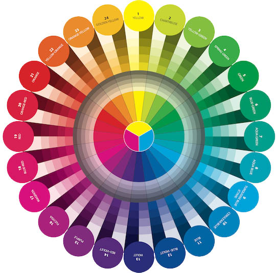
In the world of brands, red is the color of a retailer's personality that attracts attention. Blue is the color that contrasts with red. Blue creates a sense of peace and quiet, and idle. Blue is the color of the company, and creates stability. For example, from logos to cans, cartons, cartons of Coca-Cola are red, whereas IBM is blue.
The other colors are the colors between these two extremes. Orange is closer to red than blue. Green is closer to blue than red. Yellow is a neutral color. But because it is within the range of wavelengths that our eyes can detect, yellow is also the lightest. Therefore, yellow is used in "pay attention" spots such as yellow traffic lights, yellow painted lines, yellow signs.
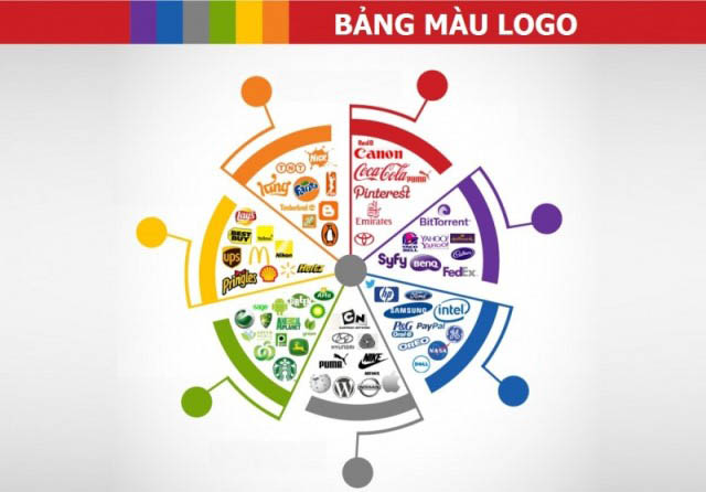
After many years, some colors have come with many different characteristics such as nature, special occasions and movements. Pure white, for example a wedding dress. Luxury black, e.g. Johnnie Walker Back Label wine label. Blue is the color of leadership, for example the blue reward ribbon on the horse race winner.
Purplish red is regal, noble. Green is the color of the environment and health, for example, the colors of the symbols Greenpeace, Healthy Choice, and SnackWell’s. Besides, the color of packaging patterns also changes with each festive season of the year. For example, red always appears during Christmas or New Year.
When choosing a color for a brand, from logo to product packaging, managers often focus on the mood they want to create for the viewer, rather than some unique brand identity. And when mood is considered important, other factors have to make room.
>>> Discover the secrets of color in paper packaging design
Why choose unique colors in product packaging design?
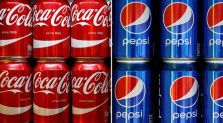
Two brands of the same product type always choose colors opposite to each other. To make a difference and attract consumers. Many large companies have synchronized colors, from logos, paper packaging products, labels, catalogs, brochures to social media channels such as websites.Red brown cola juice. So the right color for a cola brand is red. That's one reason why Coca-Cola has chosen over 100 years for its trademark red.
Pepsi-Cola chose the worst color. They choose red and blue as brand colors. Red represents cola water, while blue distinguishes from Coca-Cola's trademark color. Over the years Pepsi has struggled to respond to Coca-Cola's color strategy, but it has not been very successful.
Be honest with yourself. In your mind, isn't the world filled with the red symbols of Coca-Cola? And is it not difficult to imagine Pepsi-Cola logos? Pepsi is there, but the lack of a unique color scheme makes Pepsi soaked in the red ocean of Coca-Cola.
Recently, Pepsi-Cola has seen the truth, or rather the reasonable color. They are doing what they should have done 50 years ago. It is to make the brand colors as opposed to the colors of its competitors.
Pepsi-Cola is "greening" everything, they even play, painting blue for a Concorde supersonic jet to convey the green message to the bottled beverage factories. This thirst around the world.
>>> Improve these to have accuracy colors for product packaging
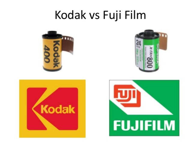
Do something opposite. Kodak is yellow, Fuij is blue. Yellow is also the color that McDonald's is known as, although its logo is almost entirely red. But what color is Burger King?
Burger King made the mistake of choosing the color of a hamburger instead of choosing the color that contrasts with the color of its competitors. Burger King has combined the yellow color of the hamburger shell with the orange red of the meat. A neat logo, but with lousy colors.
Budweiser is red, so what color should Miller choose? One of the problems Miller encountered was that they launched so many product lines that they destroyed the color identity to identify the brand. To distinguish his product lines, Miller used a range of coordinating colors. They have therefore lost the opportunity to distinguish themselves from Budweiser, their biggest competitor.
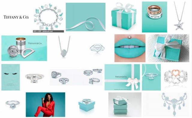
Think of the unmistakable color on Tiffany jewelry box. By standardizing a single color and using it uniformly for years, we can create a visually strong presence in this messy world. At Christmas, every brand, every store uses green and red to decorate, from M&M’s to Macy’s.
However, Tiffany gained even more attention when it became a gift placed under the Christmas tree. The wives hug and kiss their husbands as soon as they see the blue box resembling a bird's egg shell. No need to open it to know what the gift carton box has inside.
Perhaps we have seen more Miller cans than Tiffany's. But we all know it was Tiffany while not sure if it was Miller. While a single color is always the best color strategy for a brand, sometimes multiple colors can be used at the same time.
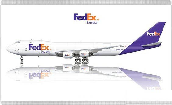
Federal Express (Fedex), the leading overnight delivery company, wanted the packages to stand out on the recipient's desk. So they combined two shocking colors, orange and purple. When a package delivered by Fedex arrived, everyone could see that parcel was delivered by Fedex. It's like orange and burgundy bathing suits in the blue ocean of companies.
Using the same color over and over many years can help a brand to burn into people's minds. Take a look at Caterpillar yellow, United Parcel Service brown, Coca-Cola red and IBM blue. The miracle that blue has brought to Big Blue is also what a unique color will bring to his brand.
Khang Thanh - The packaging manufacturer in Vietnam specializes in producing paper bag, rigid box, labels, hangtag, books, calendar, POSM and so on. Contact us to support your brand with the right packaging:
KHANG THANH - HOUSE OF PACKAGING
Tel: (+84) 77 8878 222
Email: info@khangthanh.com
Tel: (+84) 77 8878 222
Email: info@khangthanh.com

