Discover the secrets of color in paper packaging design
Discover the secrets of color in paper packaging design
Packaging design is a combination of materials, structure, presentation, images, colors and other components that create visual appeal for the target communication purpose and marketing strategy of a company brand or product that color is the "golden key" that determines the success of that design.
If used well, color will be an important element for any branding toolkit. Most famous brands have used colors to indirectly influence buying decisions and change consumer perceptions. However, the colors of the packaging designs of different industries have different uses.
What is the meaning hidden deep behind each color used on packaging?
In many studies on the psychological impact on green, many color researchers have found that blue brings the message of trust. That's why blue is used so often and most people love blue.
Blue is the color of faith, peace, discipline and loyalty (original). The green color reminds you of calmness and serenity. Therefore, most packaging products, paper boxes in the health sector often use blue as the dominant color, because blue brings a sense of trust and serenity.
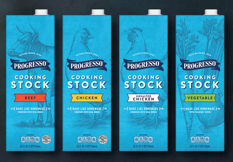
This is a much needed emotion in this area. Besides, in the health field, the types of packaging, paper boxes we often see a combination of blue and white to create a sense of purity, clean and reliable.
Because blue is a color that symbolizes purity, the packaging of pure drinking water products often uses this color to express this aspect.
Although blue is considered a great color, it will never be used for any type of packaging related to the food field. According to many studies, green color alleviates cravings. Therefore, dieters often use green plates to reduce their intake of food to help maintain weight.
In the theory of evolution, blue is associated with toxins, except for blueberries and plums. Therefore, in the design of food packaging and paper boxes, the unwritten rule is to never use blue in packaging design for food-related products.
Red stimulates the pituitary gland, increases the heartbeat, and makes people gasp. The internal reaction of the body when exposed in red makes the body reaction become aggressive and powerful. Therefore, in the design of food packaging often use red color to stimulate appetite. Red brings a sense of glamor, a color often used in food packaging design.
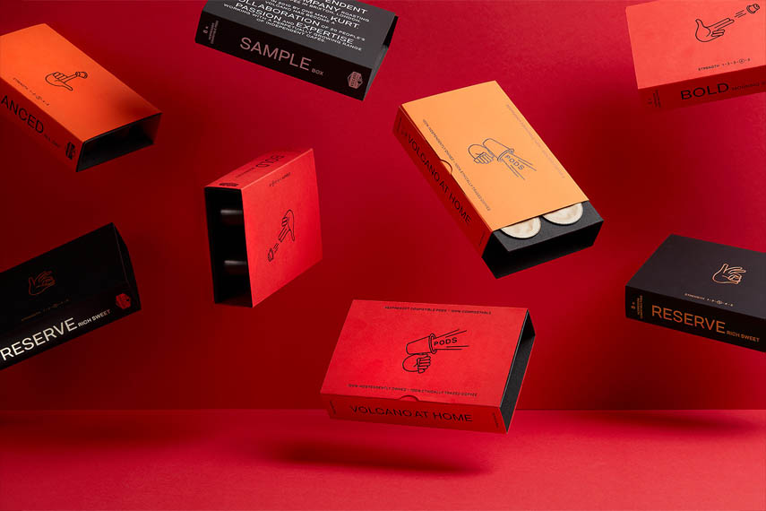
In Eastern culture, red is considered a lucky color, showing the spirit of fighting and winning.
But in the West, red also symbolizes blood, war, pain, and even threats. Therefore, be careful in using red to take advantage of and avoid causing excessive antipathy.
Orange is a hot color scheme. Therefore when used in packaging designs, paper boxes should be considered so that this color does not overwhelm the actual message of the advertisement. Orange creates a sense of joy, stimulating action.
Orange mixed with red and yellow creates a sense of collective and often associated with childhood. Therefore, in packaging designs, paper boxes for children's products, most designers often use orange as the main color.
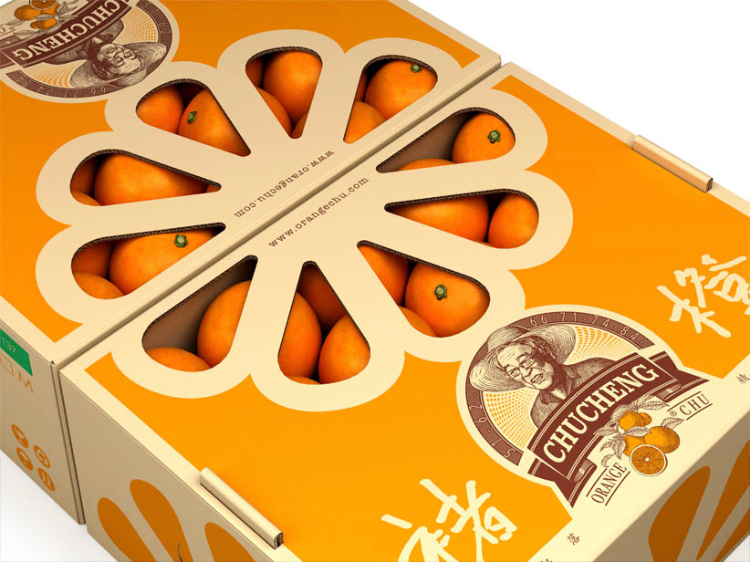
In addition, there are many studies for attractive orange with high-class market goods, suitable for health services, hotels and beauty care institutes for women.
The original dark orange color gives a message for limited-time products. This color indicates the urgency, makes the message more noticeable and takes action. If the product is in the low-priced segment, the original orange is also a consideration for use as the main color in the packaging design.
With beverage products, orange is also the favored color, because orange brings a sense of fun, stimulating the act of opening the lid.
Green is the ideal color for environmental products and outdoor products. Green is essentially a symbol for natural colors. Therefore, green color implies health, freshness and tranquility. The darkest color gamut also has different meanings.
Because of the symbol of natural colors, green is often used as the main color for packaging of products associated with nature, showing purity. In particular, bottled drinking water products often use this color scheme.
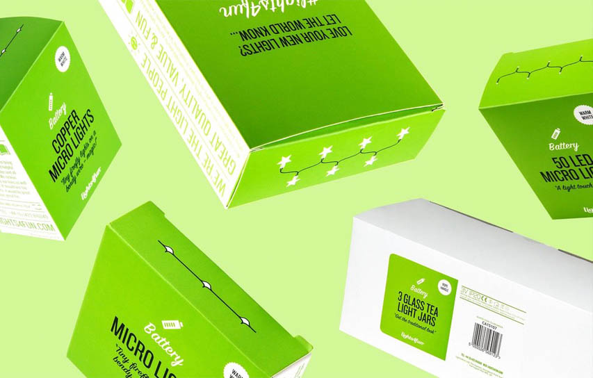
Green is also a color that can improve creativity. A study of "green effects" has shown that participants have more creative ideas when presenting with a green flash than other colors. Expressing creative packaging, blue is also not a bad choice.
Although many retailers still prefer to introduce their products as a solution that is suitable for both genders. However, for cosmetics manufacturers often target more specific customers like men or women.
For men's products such as razors, household items, the combination of masculine elements in packaging, paper boxes in colors such as black, gray, brown, the main square blocks of sharp edges is the key to creating superior sales rates.
In contrast, for products manufactured to target female customers, if the packaging and design box appear soft, feminine packaging, it is assessed to be aesthetic and practical. see off.
This type of packaging is designed in this style to both express the characteristics of the product and to appeal to women. In particular, the favorite tones of women are listed as white, purple, pink or blue.
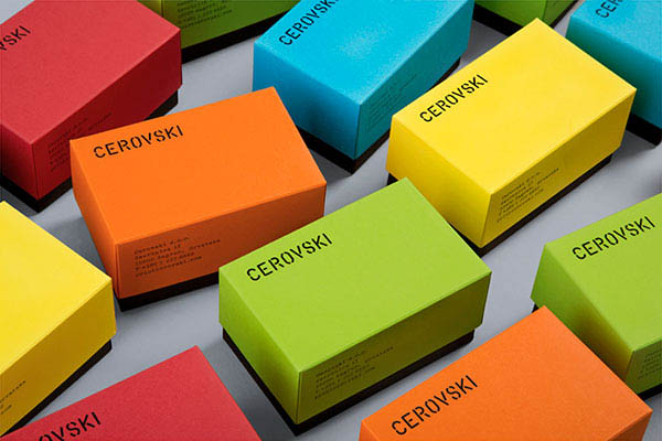
A good packaging must attract good consumer perception of the product through looking, looking and touching the product.
As a professional packaging and paper box designer, you cannot overlook any factors to make a packaging product successful. Therefore, the right color choice for the product is also a factor not to be missed.
Before starting to design packaging products, paper boxes, designers need to carefully understand the needs and target customers. Identifying consumers' needs and wants for a product and its packaging will help guide and design it faster and more efficiently.
Khang Thành - The packaging manufacturer in Vietnam specializes in producing paper bags, carton box, carton offset, labels, hangtag, books, calendar, POSM and so on.
KHANG THANH - HOUSE OF PACKAGING
Tel: +84 (0) 77 8878 222
Email: info@khangthanh.com
If used well, color will be an important element for any branding toolkit. Most famous brands have used colors to indirectly influence buying decisions and change consumer perceptions. However, the colors of the packaging designs of different industries have different uses.
What is the meaning hidden deep behind each color used on packaging?
Blue packaging - Building consumer confidence
In many studies on the psychological impact on green, many color researchers have found that blue brings the message of trust. That's why blue is used so often and most people love blue.Blue is the color of faith, peace, discipline and loyalty (original). The green color reminds you of calmness and serenity. Therefore, most packaging products, paper boxes in the health sector often use blue as the dominant color, because blue brings a sense of trust and serenity.

Blue is used extensively in health, insurance, education because it provides a sense of security and reliability.
This is a much needed emotion in this area. Besides, in the health field, the types of packaging, paper boxes we often see a combination of blue and white to create a sense of purity, clean and reliable.
Because blue is a color that symbolizes purity, the packaging of pure drinking water products often uses this color to express this aspect.
Although blue is considered a great color, it will never be used for any type of packaging related to the food field. According to many studies, green color alleviates cravings. Therefore, dieters often use green plates to reduce their intake of food to help maintain weight.
In the theory of evolution, blue is associated with toxins, except for blueberries and plums. Therefore, in the design of food packaging and paper boxes, the unwritten rule is to never use blue in packaging design for food-related products.
The packaging uses red color - Creating excitement and stimulation
Red stimulates the pituitary gland, increases the heartbeat, and makes people gasp. The internal reaction of the body when exposed in red makes the body reaction become aggressive and powerful. Therefore, in the design of food packaging often use red color to stimulate appetite. Red brings a sense of glamor, a color often used in food packaging design.
Red brings a sense of power, strength and dynamic, so it is used in many festive packaging such as Mid-Autumn Festival, Chinese New Year
In Eastern culture, red is considered a lucky color, showing the spirit of fighting and winning.
But in the West, red also symbolizes blood, war, pain, and even threats. Therefore, be careful in using red to take advantage of and avoid causing excessive antipathy.
Orange packaging - Cheerful, stimulating action
Orange is a hot color scheme. Therefore when used in packaging designs, paper boxes should be considered so that this color does not overwhelm the actual message of the advertisement. Orange creates a sense of joy, stimulating action.Orange mixed with red and yellow creates a sense of collective and often associated with childhood. Therefore, in packaging designs, paper boxes for children's products, most designers often use orange as the main color.

In addition, there are many studies for attractive orange with high-class market goods, suitable for health services, hotels and beauty care institutes for women.
The original dark orange color gives a message for limited-time products. This color indicates the urgency, makes the message more noticeable and takes action. If the product is in the low-priced segment, the original orange is also a consideration for use as the main color in the packaging design.
With beverage products, orange is also the favored color, because orange brings a sense of fun, stimulating the act of opening the lid.
Green packaging - Symbolizes the meaning of health, freshness and calm
Green is the ideal color for environmental products and outdoor products. Green is essentially a symbol for natural colors. Therefore, green color implies health, freshness and tranquility. The darkest color gamut also has different meanings.Because of the symbol of natural colors, green is often used as the main color for packaging of products associated with nature, showing purity. In particular, bottled drinking water products often use this color scheme.

Green is also a color that can improve creativity. A study of "green effects" has shown that participants have more creative ideas when presenting with a green flash than other colors. Expressing creative packaging, blue is also not a bad choice.
Purple, black, white and pink packaging attracts beauty lovers
Although many retailers still prefer to introduce their products as a solution that is suitable for both genders. However, for cosmetics manufacturers often target more specific customers like men or women.For men's products such as razors, household items, the combination of masculine elements in packaging, paper boxes in colors such as black, gray, brown, the main square blocks of sharp edges is the key to creating superior sales rates.
In contrast, for products manufactured to target female customers, if the packaging and design box appear soft, feminine packaging, it is assessed to be aesthetic and practical. see off.
This type of packaging is designed in this style to both express the characteristics of the product and to appeal to women. In particular, the favorite tones of women are listed as white, purple, pink or blue.

A good packaging must attract good consumer perception of the product through looking, looking and touching the product.
As a professional packaging and paper box designer, you cannot overlook any factors to make a packaging product successful. Therefore, the right color choice for the product is also a factor not to be missed.
Before starting to design packaging products, paper boxes, designers need to carefully understand the needs and target customers. Identifying consumers' needs and wants for a product and its packaging will help guide and design it faster and more efficiently.
Khang Thành - The packaging manufacturer in Vietnam specializes in producing paper bags, carton box, carton offset, labels, hangtag, books, calendar, POSM and so on.
KHANG THANH - HOUSE OF PACKAGING
Tel: +84 (0) 77 8878 222
Email: info@khangthanh.com

