9 takeaway tips for better packaging design
9 takeaway tips for better packaging design
You’ve developed an innovative product and are excited to introduce it to consumers, but you also know that competition is tougher than ever. A new product enters the market every week pushing retailers to add more shelves to their stores and forcing brands to compete for precious front-and-center shelf space. There’s a very real risk of becoming lost in the crowd.
Today, standing out requires more than just a great product. It requires great packaging design.
Today, standing out requires more than just a great product. It requires great packaging design.
Here, we’ve chosen nine successful packaging designs containing everything from tea to beef jerky to provide inspiration for your own packaging. Each design offers a killer takeaway tip to help you along the way. Check them out!
.jpg)
Keep it simple (and give consumers a sensory break)
Minimalistic package design is quite the trend toda - and for good reason. Consumers are bombarded with visual information at every step of the purchasing process, so much so that many don’t even notice the bells and whistles of packaging design. Who has the time to notice these details?
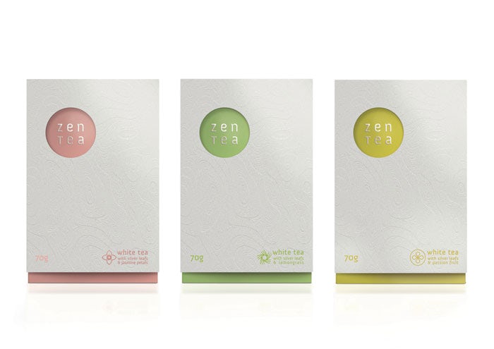
Zen Tea’s clean, simple aesthetic is all about minimalism, and the packaging represents this accurately. The three varieties of white tea are differentiated by three cool colors: pink, yellow and green set against a light gray background. When you slip the gray sleeve off the box the solid color is revealed with a delicate jasmine blossom drawing.
The overall design is minimal, but not simplistic. Designer Konrad Sybilski uses subtle elements to add a unique flair to each box. Textured patterns on the package sleeve are reminiscent of a Zen garden, and small icons at the bottom right corners characterize the different varieties of tea.
Minimalistic design by Konrad
Think outside the box (or bottle)
Aqua Rose is bottled water infused with the healing properties of rose petals. The refreshing energy from this purified water is said to boost beauty and nutrition. To target affluent consumers, the company decided to go with a 3D design for their bottle, transforming an ordinary bottle into something exclusive.
The curves at the top of the bottle imitate the petals of a rose, while also making it easier to grip. By adding details at the top, the designer also managed to balance out the bottle’s bottom heavy design. Since this design deviates dramatically from the standard bottle, production costs were higher, but luckily the target market can afford it!
>>> 5 ways to attract customers from packaging products
.jpg)
Aqua Rose 3D bottle design by Cabinet for Aqua Rose
Keep it mysterious (and don’t put it all on the front)
Superfly is an all natural non-alcoholic cocktail by Firefly, creators of innovative juices infused with botanical extracts. The packaging company paired up with a prominent English mixologist to create a dynamic juice combination that can be consumed on its own or mixed with the spirit of your choice. To match the bright, hip nature of the beverage, Firefly looked for a design that was equally unique.
The result? A bottle with an especially strong shelf appeal. Most juice drinks use images or icons of fruits in their package design and most juice drinks look the same. But Superfly bottles look like a work of art. When placed on the same shelves as other drinks they will undoubtedly get a second look. There’s an intoxicating element of mystery to this juice. The vibrant hues of the design instantly attract attention. Plus there is no logo on the front! People will reach for this bottle, if only to find out what company is behind the design.
>>> 5 Basic principles in product packaging design
>>> 5 Basic principles in product packaging design
.jpg)
Think about longevity (and don’t go out of style)
Ethical is Beautiful is a cosmetics company that sells soaps and other bath products. The cosmetics are ethically sourced, and the company also lends its hand to rescuing and rehabilitating orangutans by donating 10% of its profits to the cause.
These sleek, beautiful labels are a clever way to navigate package design. Beauty companies with a variety of products will often differ in size and shape. The lotus flower logo can fit on any size label to be used on any packaging product creating continuity throughout the product line.
.jpg)
Cosmetic Packaging by Martis Lupus for Ethical is Beautiful
Consider your customer (and provide them value)
Sassafras is a company that designs homeware products for moms and their children. The goal is for mamas to make delicious cakes and pizzas while the kids have fun. Sassafras hoped to embody this sensibility through creative packaging.
The ingenious design has a dual purpose: while mom is busy baking, the kits can be opened and cut to make animal masks — a donkey, zebra, monkey or hippo. The packaging also reflects the company’s sustainable outlook, using 100% recycled packaging material with no adhesives.
Be sustainable (and differentiate yourself)
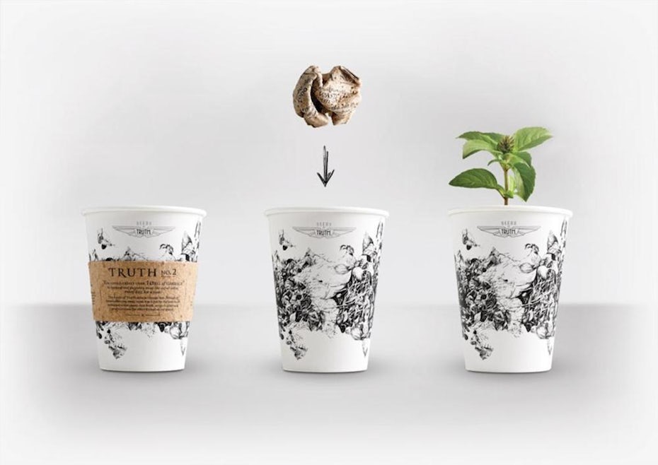
Truth Coffee is a luxurious coffee chain in Cape Town, South Africa voted by the Daily Telegraph as one of the world’s best coffee shops. But like every other coffee shop, their disposable coffee cups ended up adding to the planet’s already overflowing landfills.
Every day, hundreds of thousands of coffee cups are tossed out—and they’re not biodegradable. South African creative agency Native VML teamed up with Truth Coffee to come up with a solution: zero waste coffee cups.
The biodegradable cups come with a sleeve composed of herb seeds that will grow into plants. Scrunch the sleeve, drop it in the cup, and fill it with soil and you have a mini planter. Or you can plant the cup and sleeve directly in your garden. Now, cups aren’t packaging, but this eco-friendly venture between a creative agency and retailer demonstrates the innovative earth-protecting possibilities for packaging.

Sustainable Package Design via Daily Coffee News
Tell your story (and give your brand a narrative)
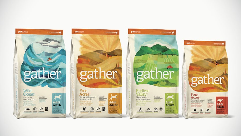
Gather Premium Pet Food offers certified organic, sustainable and GMO-free food for cats and dogs. The company proudly sources its produce from a select few suppliers and was looking for a package design that aligned with its values.
Using collage based illustrations, designers told the brand’s story tracing the food from its source to your pet’s bowl (kind of like farm-to-table for dogs). To add to the unique nature of the packaging, the illustrations travel from the front of the bag to the back, creating an interesting eye trajectory.
The company’s dedication to sustainability is also infused in its packaging. The bag is made from USDA certified bio-based materials to reduce its carbon footprint.
>>> 6 laws to design impressive paper packaging
>>> 6 laws to design impressive paper packaging
Choose bold colors (and go beyond your brand)
Quality Candy Company is part of the healthy candy movement with treats made from fruit and vegetable extracts.
To support their bright fruit flavors, the company needed bright, kid-friendly packaging. The result: an eye-catching design in a range of delightful colors in a package that resembles a crayon box. A cheerful, smiling fruit brings the message home: this candy tastes good and is made from ingredients that are good for you.
.jpg)
Kid Friendly Package Design by tachimaR for Quality Candy Company
Showcase your product (and give folks a sneak peek)
Healthy Generation was looking for a packet design for their organic beef jerky. The product is targeted to busy people who are looking for convenient and healthy food to turn to when they need a snack. The company was hoping for a clean design that was playful and modern. The designer provided a unique solution.
Using icons, he listed all the attributes of the product (no preservatives, no nitrates, no MSG and gluten-free).
Using icons, he listed all the attributes of the product (no preservatives, no nitrates, no MSG and gluten-free).
To differentiate this jerky even further the designer came up with a unique package window so customers can see what they are getting. This kind of transparency helps to build trust.
>>> Using window paper boxes to attract customer
>>> Using window paper boxes to attract customer
.jpg)
Beef Jerky Package Design by DLab for Healthy Generation
As you explore the many packaging options available today, don’t be afraid to take a risk! A great product can get lost in a dull package. What moves you to take a product off the shelf for the first time? Let us know in the comments below.
KHANG THANH - HOUSE OF PACKAGING
Tel: +84 (0) 77 8878 222
Email: info@khangthanh.com


